Objective
Product design and visual appearance for the robotics startup Visero
Outcome
Developing a brand identity and all its visual components alongside the technical product design of the robot arm
Design Challenges
Before going into the design process we had to understand the specific technology the startup is using in their product and what exactly their unique selling point was. Therefore we read through their publications and asked them questions on their research approach. Parallel to getting to know the startup’s needs and specifying the design brief at hand, we also worked on developing a brand for the startup. A brand is based on values and characteristics that the startup and its members believe in. A big part of the brand development process is getting to know the team at Rovi: what inspires them, what makes them tick and how they see themselves achieving their goals.
Corporate Identity
Corporate identity is the collective term for Corporate Design, Corporate Communication and Corporate Behavior. Designing a Corporate Identity (CI) is therefore a rather complex endeavor. Just as we dug to the core of the technology and how the sensor system works, so did we also try to dig to the core of the brand and to the attributes that could be used to define them. We conducted a Brand and Users Workshop on the 8th of May with this goal in mind. This co-creation workshop helped the startup to understand our design mindset and how they could benefit from our work. In the following weeks we would meet once or twice a week to show our progress and discuss details.
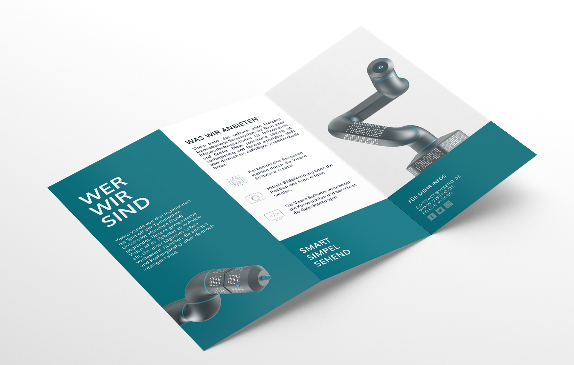
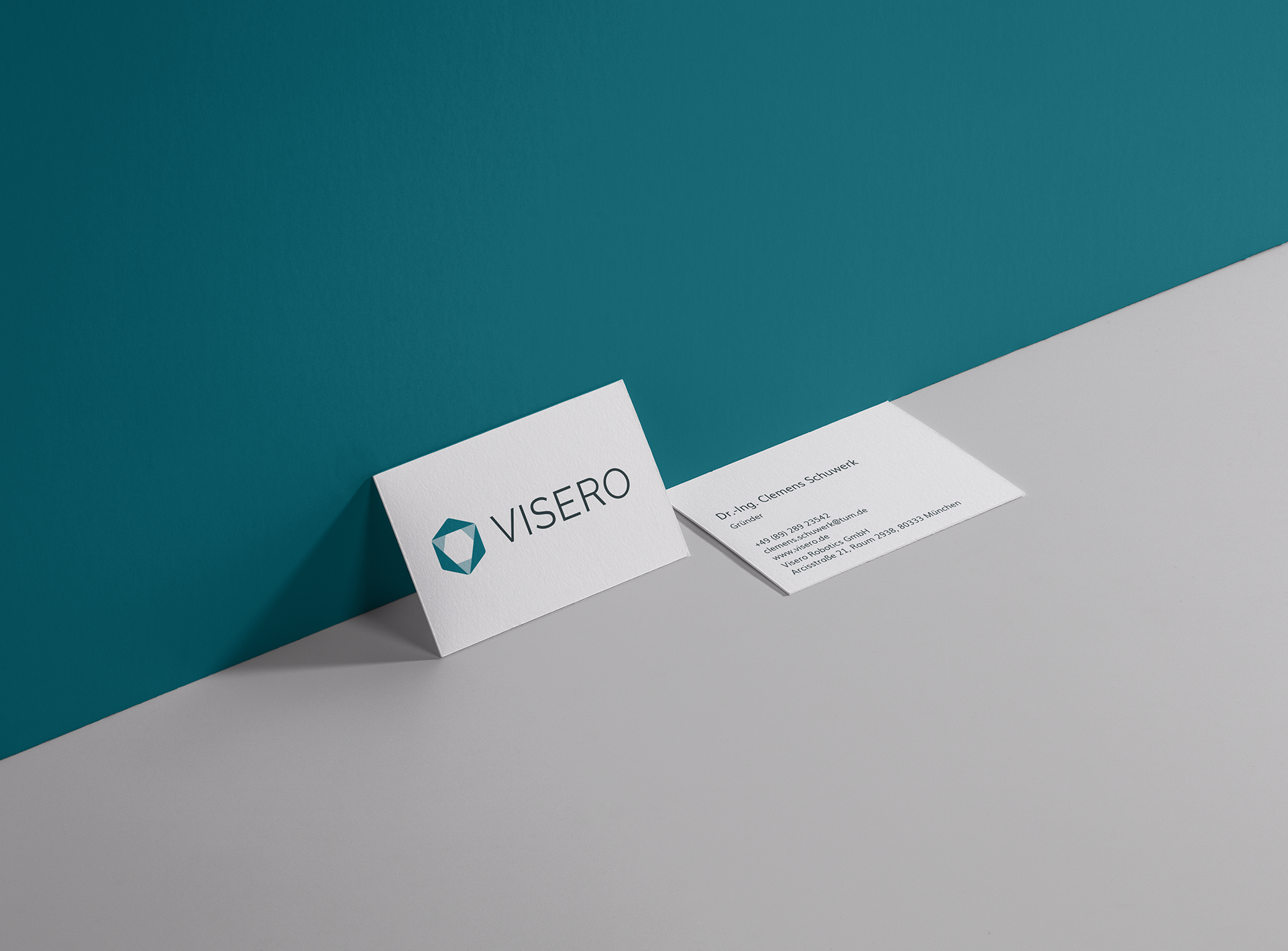
Designing the CI included coming up with and evaluating names, designing a logo, color scheme, typeface and style guide and furthermore CI applications like website, flyer, poster, stationary, envelope, email signature and business cards. In the following I will further explain the logo, color and font choices.
Logo
The construction of the logo is greatly influenced by the technical requirement of the robot arm. The visually dominant part of the arm is the hexagon profile of the connecting elements between the joints. This geometry is uncommon in the robot industry and thus stands out among the others. Having manifested itself initially as a disadvantage, the shape turned into an inspiration and an inherent part of our product design as well as our logo. The hexagon would become our unique shape and would bring with it a great recognition value.
The outer border of the logo is a hexagon and a second smaller hexagon can be found rotated by 30 degrees within the bigger shape. The inner hexagon arises by inscribing a triangle into the outer hexagon. The three corners of the triangle symbolize the three dimensions (i.e. the x-, y- and z-axes) — the way the arm moves in space. Apart from the “three-dimensional” connotation the three corners also refer to the three cameras positioned around the robot arm in order to capture its every movement. Because the pure geometric shape with its sharp edges is against the softer touch characteristic of our brand, we gave the entity rounded corners. The outer hexagon shows a greater radius than the inner one. The sign is an ensemble of colored areas without outlines. It uses the primary brand color and a variant of the same color with lesser opacity.
The logo consists of both the logo symbol and the brand name “Visero” spelled out in capital letters. We chose the open-source Google font “Raleway” in the style Regular. The font is dominated by geometric lines and constant widths.
Color Palette
I started by defining the primary color of the company. In order to do so, I analyzed the existing colors of the known robot manufacturers. Organizing the competitors by color gave me a clear view of where I wanted to go. I decided for a petrol blue due to the fact that we wanted to incorporate the characteristics associated with blue, viz. “technical, solid and trustworthy” and combine those with a green tone which stands for attributes like “natural, fresh and functional”. The petrol therefore distinguished Visero from the established firms and represented the brand identity we had defined.
In order to make sure the chosen shade of petrol was a stable color, I carried out several print tests. The primary color petrol is accompanied by the two secondary colors, anthracite and white. Anthracite is the color of the product and white the background color of the graphic elements. They can both be extensively used without fear of distracting from the primary color, petrol. The brand color palette is completed by the two tertiary colors yellow and dark blue. They add more flexibility to the palette and counterbalance the blue-green scheme. They both serve as accent colors and should be used very sparingly. They appear for instance on buttons on the website or thin lines on the layout of marketing material.
Font
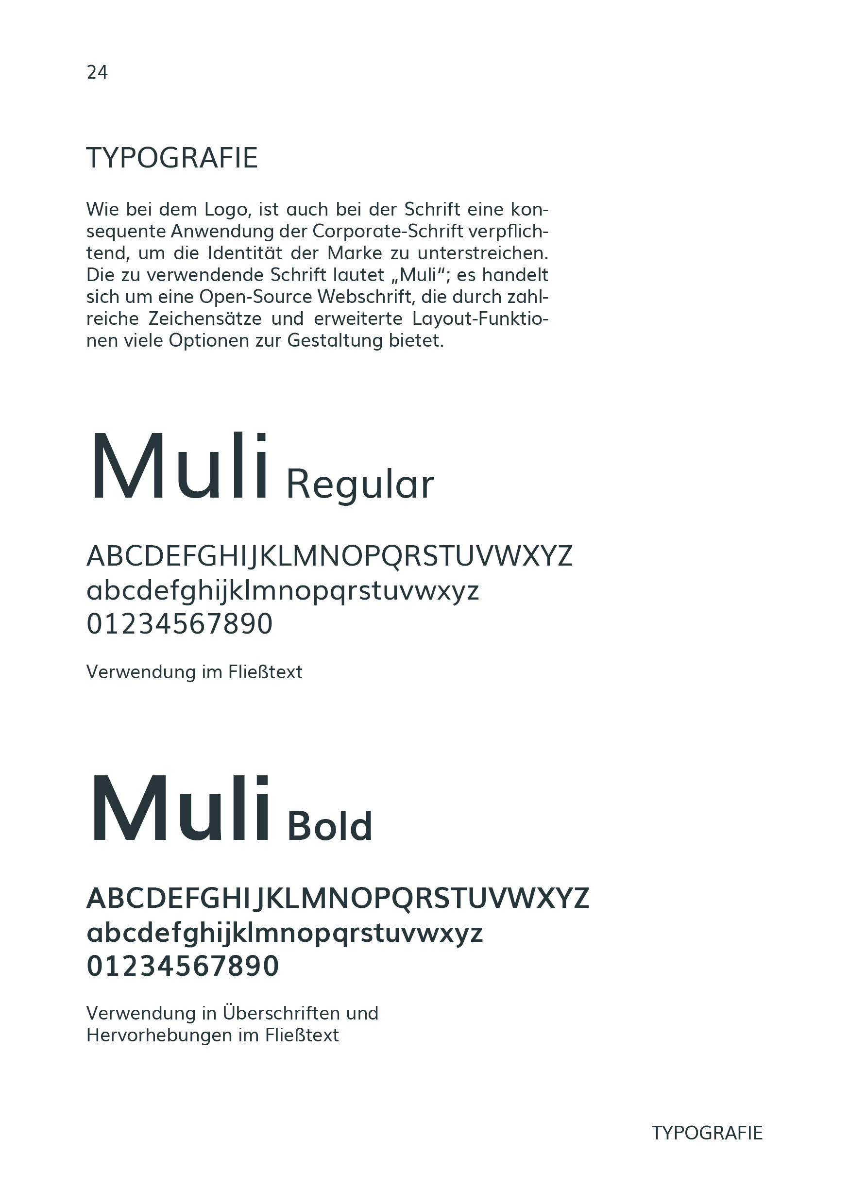
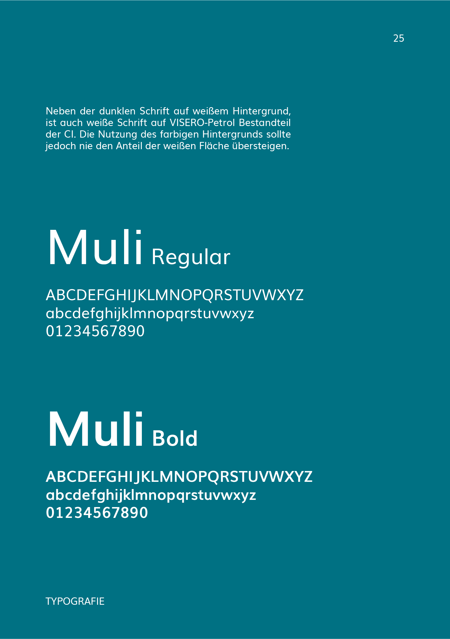
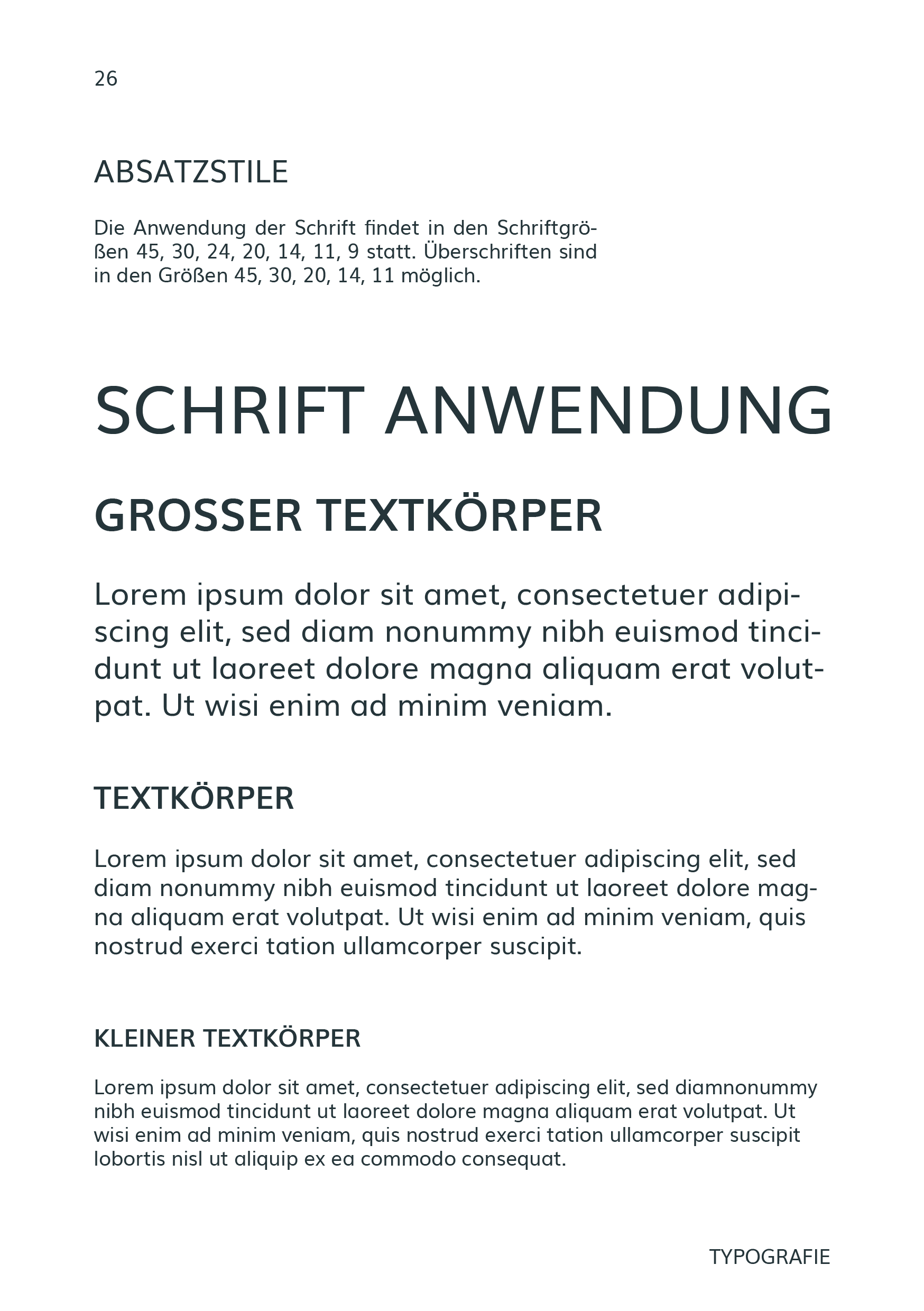
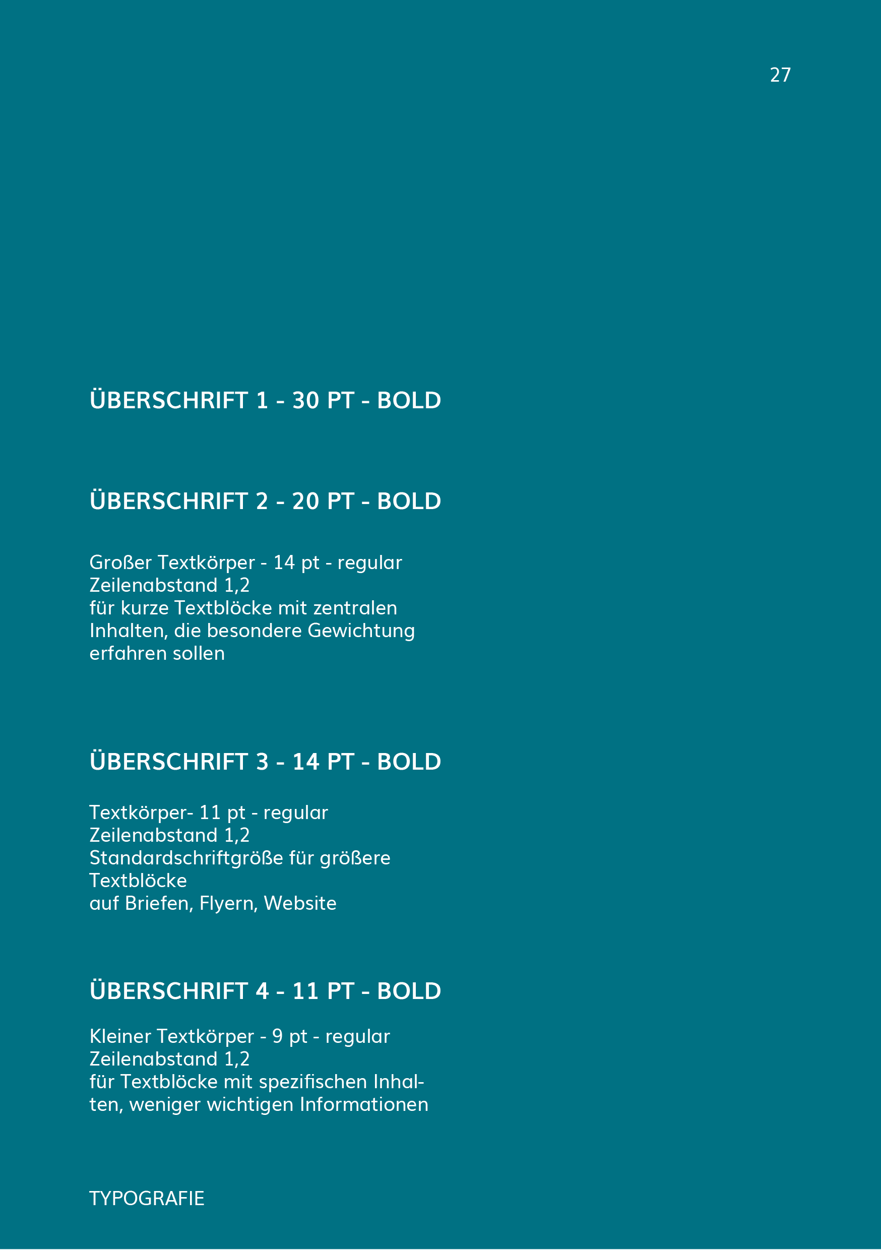
Parallel to the logo construction we started research on a suitable typeface. We were seeking to find a font that would complement the logo’s clear lines and soft edges. Finding an open-source font was a conscious decision of ours. By the time we decided on the text font we had already chosen the logo typeface, so in addition to all the requirements stated above, the font also had to be harmonious with Raleway Regular. We tried various fonts until we finally decided on a font named Muli, of which we decided to use two styles: bold and regular. We decided on Muli due to its clear geometric shape but overall soft appearance.
Scroll through the website
↧
Product Design
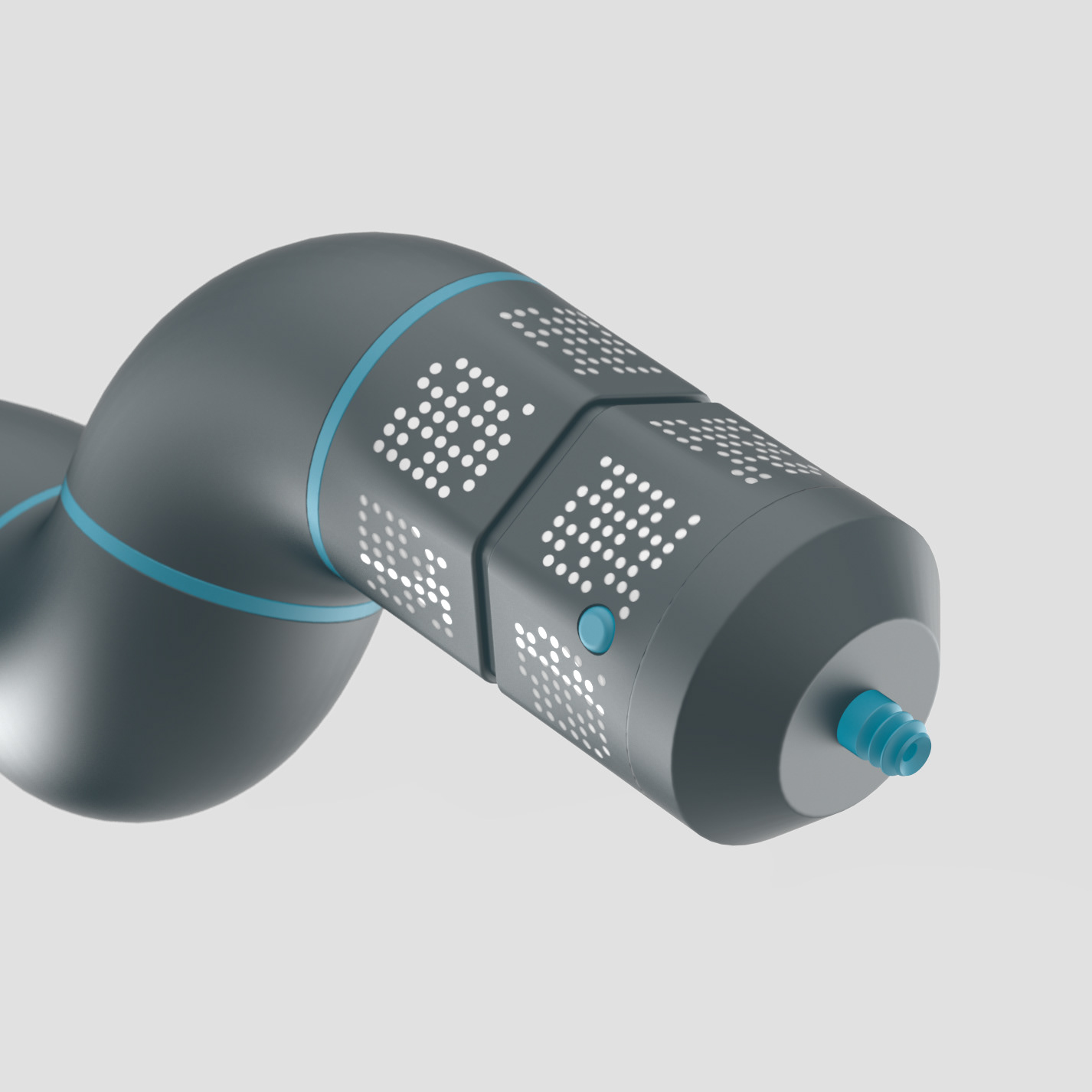
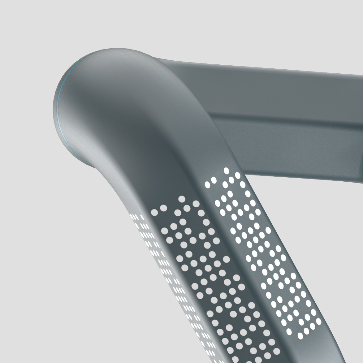
Since the product is technology-driven the functional analysis took up a great part of the design process. The basic requirements of the robot arm were first translated into primitive geometric shapes. We knew that the cameras required a flat surface for the visual markers to be applied upon, so circular elements were ruled out. Because the robot arm is constantly rotating we had to provide as many flat surfaces as possible. For example, while a square profile works fine when one of the faces is towards the camera, the pattern recognition is very inaccurate when there is a displacement of 45 degrees. We decided that six sides were required to allow the camera to accurately recognize the markers. This was the origin of the hexagonal profile for the connecting elements.
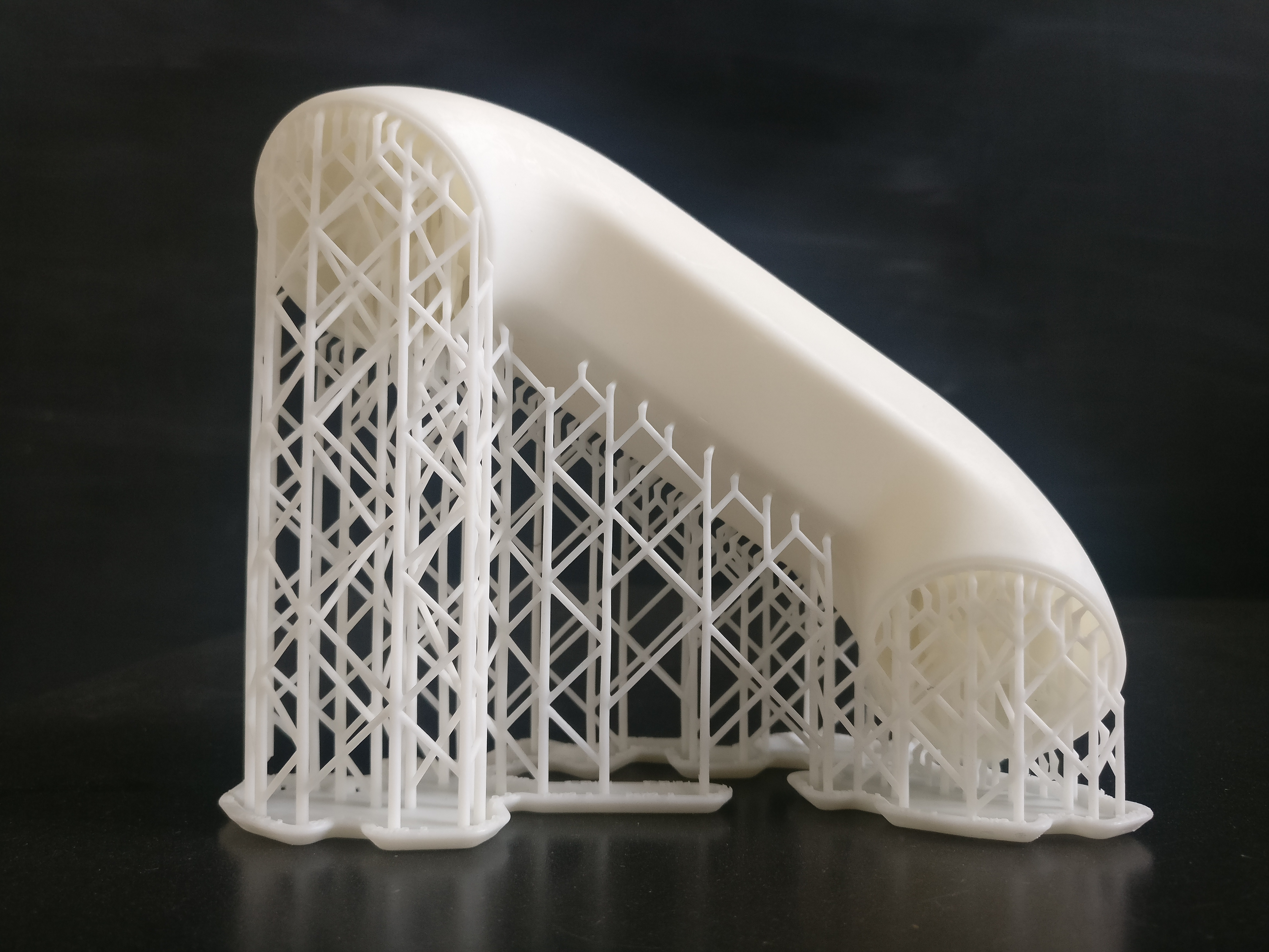
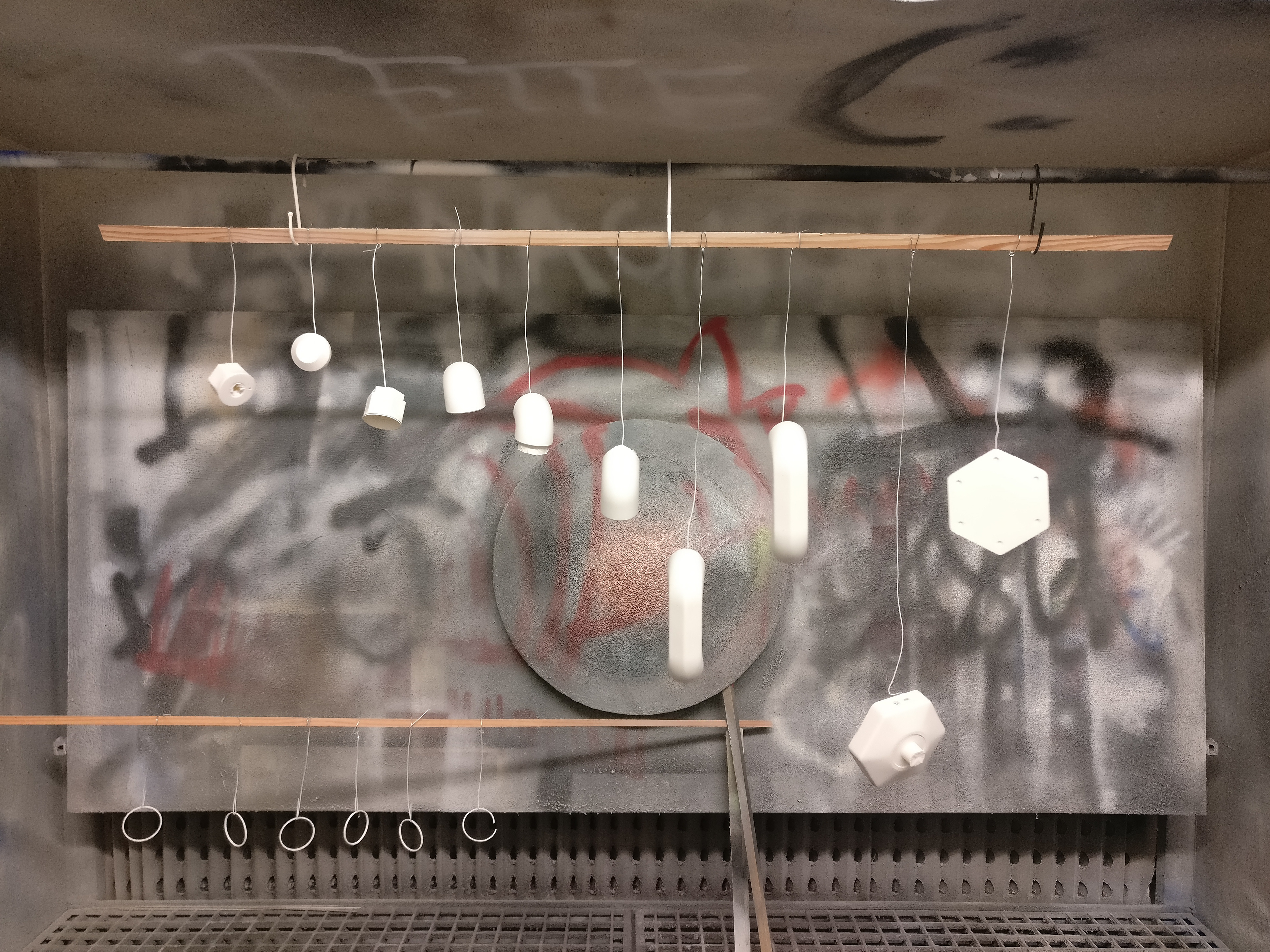
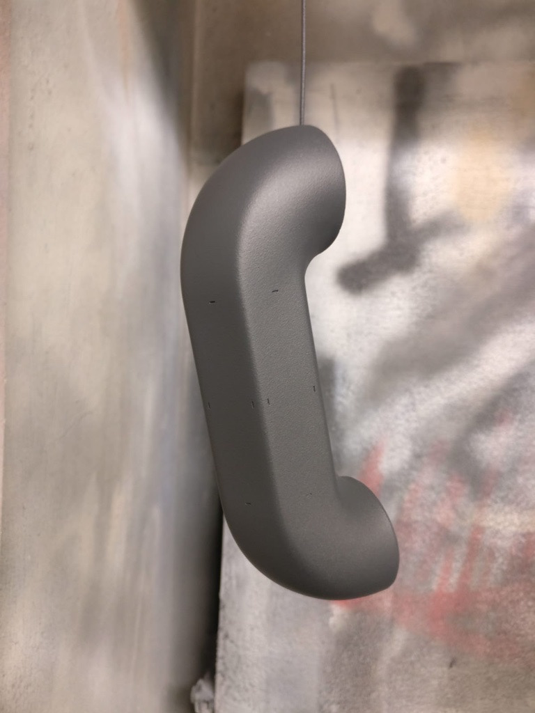
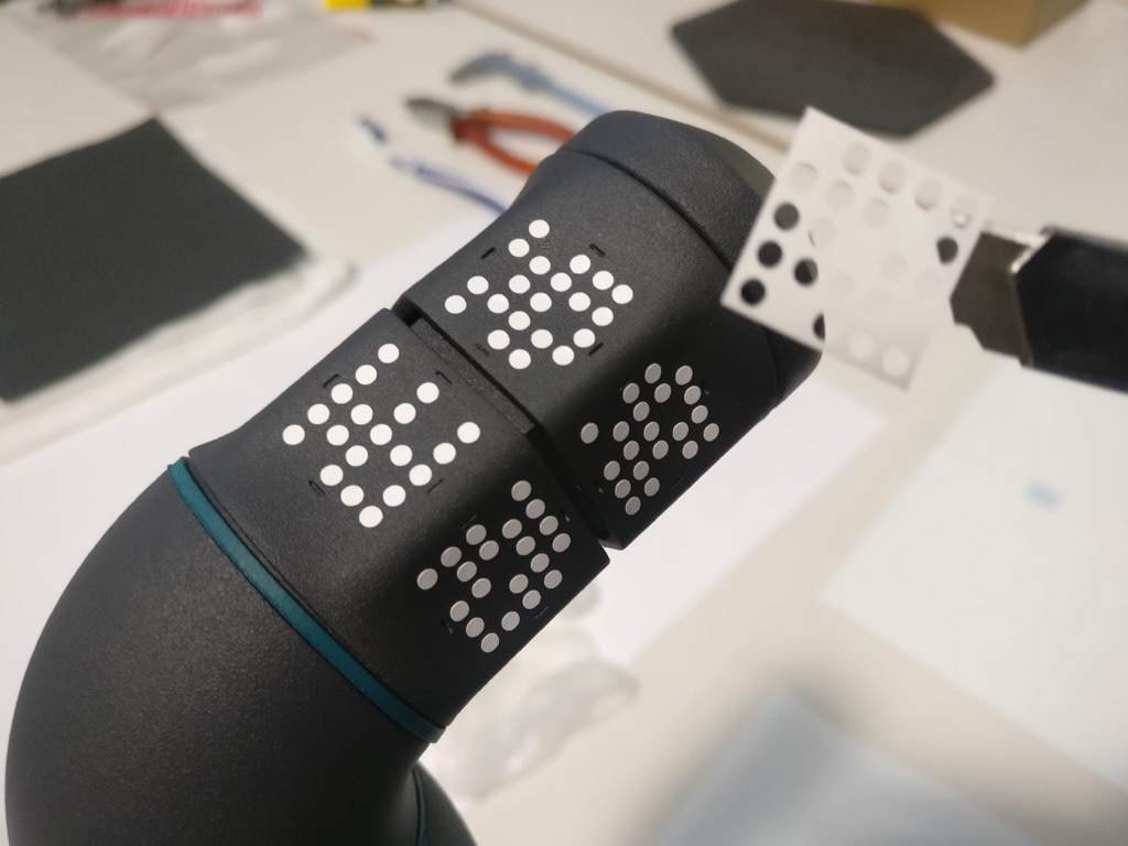
The choice of the markers was an interesting exercise in graphic design. The markers had to fulfil some technical conditions, i.e. they had to have sharp edges and contrasts, avoid symmetries and function even when used in greyscale (because the cameras are generally black and white). On top of this, they had to look good and draw attention to themselves because they were the most visible and tangible representatives of the otherwise intangible software product of Rovi. However, they could not be allowed to become too ornamental either. They had to be minimal enough to go with the brand values of the firm while also indicating their own function in some way. We went through several iterations before deciding on the one we liked.
My Role
Research on competitive landscape
Setting up workshop guidelines and moderating the co-creation workshops
Creating presentation slides - Keynote
Corporate Identity & Logo Design - Adobe Illustrator/ InDesign/ Photoshop/ Adobe XD
Product Design - Sketches and Renderings in Fusion 360
Research on competitive landscape
Setting up workshop guidelines and moderating the co-creation workshops
Creating presentation slides - Keynote
Corporate Identity & Logo Design - Adobe Illustrator/ InDesign/ Photoshop/ Adobe XD
Product Design - Sketches and Renderings in Fusion 360
